
Work
Home
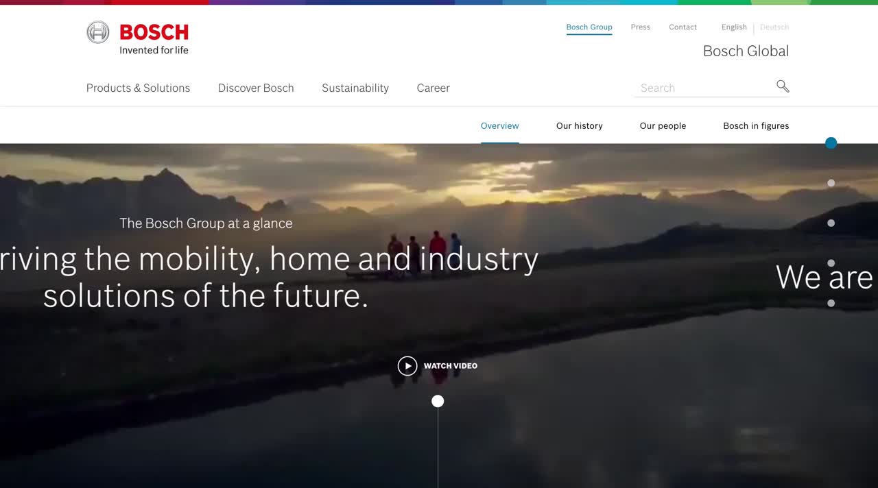
In 2015, Bosch tasked us with bringing their new corporate identity to life digitally. We created their first-ever digital styleguide and UI library, unifying the design across 150+ global websites. This scalable solution is still in use today, continuing to earn industry recognition.
We worked on:
UI / UX Design, Art Direction, Brand, Design System

Challenge
Bosch had 150+ websites with inconsistent designs. They needed a unified, scalable system to reflect their refreshed identity while remaining flexible for various platforms and regions.

We created a modular UI library with reusable components and a comprehensive digital styleguide from scratch. This system ensured brand consistency globally.


The connection between humanity and technology.

I created the first bespoke set of icons and developed a icon styleguide rooted in the brands most vauable asset - the logo. A subtle mix of angular and rounded corners lead to brand recognition. The icon styleguide is still in use today and has expanded since it's launch.
We used atomic design to create a modular, scalable UI system rooted in Bosch’s brand values. Centered around the supergraphic, the flexible design ensured consistency across all digital platforms, from content pages to campaign microsites, enabling global reuse without constant customization.


My Role:
As a Designer on the Robert Bosch account for over 1.5 years, I managed the living UI Library, creating and reviewing new components from our teams in Germany. I regularly presented updates to senior clients for approval. My work on the digital style guide spanned over 15 projects, where I ensured consistent, on-brand experiences, whether in an oversight or hands-on role.
Outcomes:
569k
visits within the first 24 hours
97%
self-directed visits through natural search (e.g. Google). No paid traffic.
3.3k
consumers registered their interest to pre-order ARIYA.